Fooderly: Designing Accessible Food Delivery for Seniors
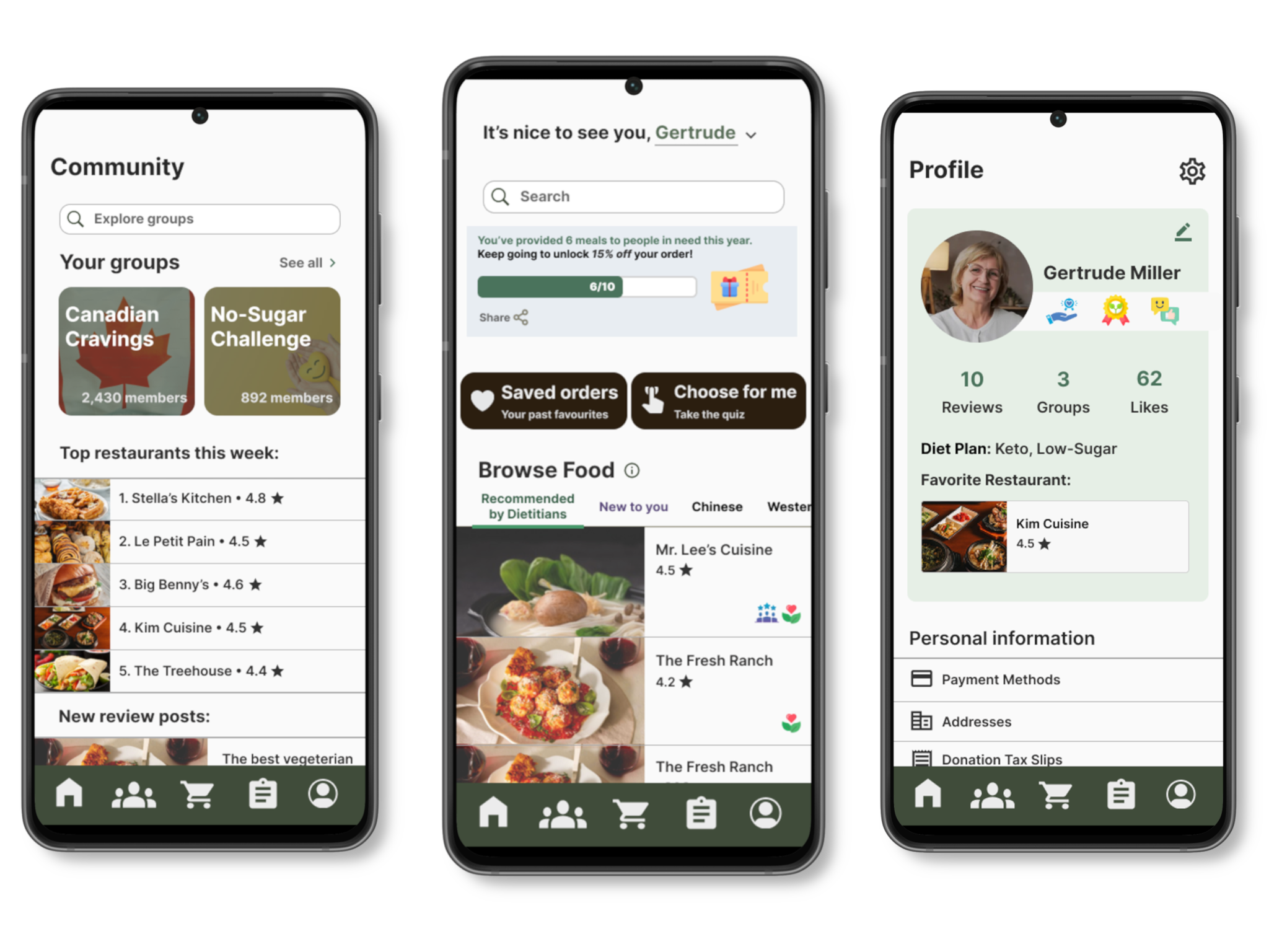
In 2022, over 7 million seniors in the US were food insecure. As a solution, Fooderly is a food delivery platform designed for elderly individuals, particularly those in rural or remote areas who face challenges with traditional apps.
Elderly populations face unique hurdles when navigating these apps, namely:
- Complex interfaces overloaded with features
- Accessibility challenges, including small text, low contrast, and confusing navigation
- Dietary concerns, such as managing restrictions/preferences
Given that access to nutritious meals is critical for seniors’ well-being, we set out to create a simpler, more inclusive alternative.
To ensure our app would resonate with the target users, we conducted semi-structured interviews, a literature review on accessible design, and competitive analysis of popular food delivery apps.
We discovered that many elderly users value clarity, reassurance, and simplicity over convenience. They often expressed anxiety about making mistakes in digital interfaces, and emphasized the importance of clear confirmation and visible progress.
Key findings:
- Seniors value clarity and predictability more than novelty
- Many dislike pop-ups and hidden icons—they prefer visible, labeled buttons.
- Dietary concerns, such as managing restrictions or preferences
- Dependence on others, undermining autonomy in managing their own nutritional health
following principles:
The design process was heavily guided by Value Sensitive Design (VSD), which puts user values at the forefront of design decisions. Through a Portrait Values Questionnaire, 3 central values were uncovered for our target group: Autonomy, Well-being, and Benevolence.
These values directly informed our design decisions through constructing Value Hierarchies:
- Autonomy → Simple, consistent navigation and large call-to-action buttons
- Well-being → “Recommended by Dieticians” list featuring nutritious and balanced meals
- Benevolence → Optional “Share a Meal” donation feature
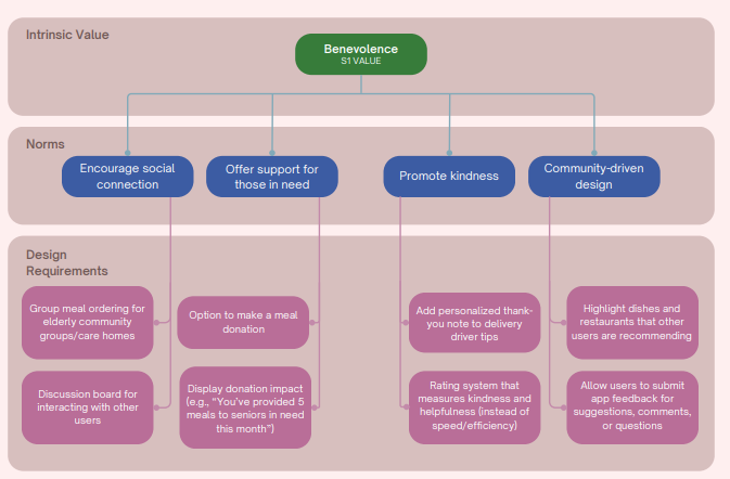
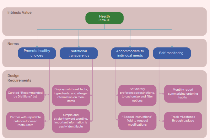
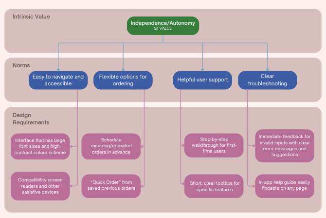
When values conflicted (autonomy vs. benevolence), we designed optional features that allowed users to customize their experience based on personal needs.
We began by brainstorming over 40 ideas using Crazy 8s and affinity mapping. We also created storyboards which captured common user journeys and frustrations, like an elderly user trying to order dinner but getting lost in pop-ups.
Early decisions:
- Keep navigation to three primary buttons: Home, Order, Community
- Replace long menus with quick filters and a “Help Me Choose” assistant
- Focus on visibility and reassurance rather than novelty
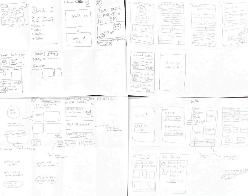

What we designed:
- A simple home screen with large, icon-based navigation
- “Help Me Choose” quiz for meal recommendations
- Quick ordering of previous orders through an easy-to-access button

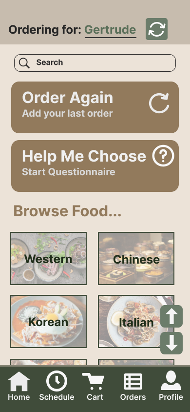


However, early testing revealed that simplicity on screen didn’t always mean ease of use. Participants found some icons ambiguous, struggled to locate the home button, and were uncertain about what step came next after adding an item to the cart.
Design changes:
- Reduce clutter on the interface by getting rid of unnessesary text
- Improve the viewing experience by increasing visual contrast
- Foster a sense of community by incorporating benevolent features
Highlights & stand-out features:
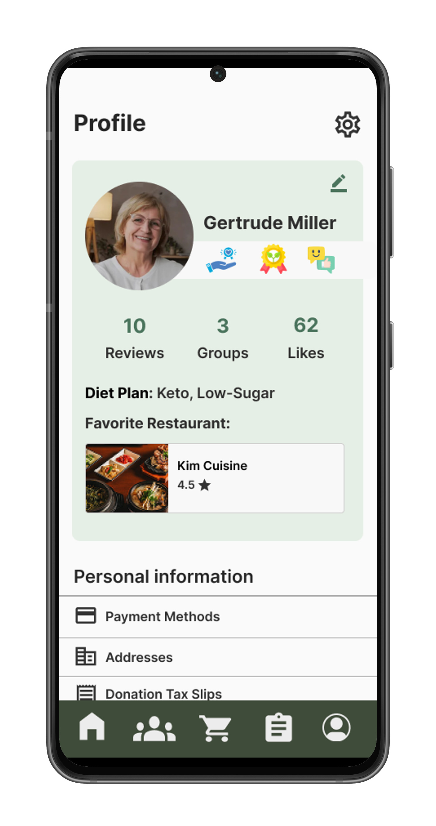
- Typography: Large sans-serif fonts and adjustable text size options
- Color palette: Warm neutrals and high-contrast accents for readability
- Copywriting: Supportive feedback like “You nailed it!” to reinforce success
- “Help Me Choose” and "Saved Orders" functions to reduce cognitive load and stress
- “Share a Meal” donation flow with progress tracking
-portrait.png)



-portrait.png)
These choices made the app not only accessible but emotionally uplifting.
All test participants agreed that the interface was notably easier to navigate for seniors compared to other similar food delivery platforms.
“It’s so much clearer than other apps, I actually know where to tap.”
“I like the focus on empathy and community. The donation feature feels very unique.”
This project taught me that designing for seniors isn’t just about larger text—it’s about emotional accessibility: making users feel secure and capable.
What worked: Large buttons, direct navigation, and benevolence-driven gamification were well-received.
What didn’t: Our initial prototypes oversimplified choices and didn’t fully reflect seniors’ dietary needs.
Takeaways:
- Using values to guide design decisions helps transform user needs into tangible interface elements.
- Simplicity ≠ clarity. Early prototypes showed that adding too many cues can overwhelm rather than assist.
- Design empowers dignity. A well-designed interface can help users feel confident, independent, and respected in their digital experiences.